In this project, you will use Google Colab to analyze health data and build a machine learning model to predict if someone is at risk of high blood pressure. You’ll explore data, train a model, and test it by entering your own values.
What’s this about? Machine learning helps computers learn from data to make predictions. In this project, you’ll use health data to predict whether someone is at risk of high blood pressure (a health condition where blood pushes too hard against arteries). The data includes features like age and smoking habits, which the computer will use to find patterns.
You’ll use a dataset about people’s health to predict whether someone is at risk of high blood pressure based on their age, exercise hours, diet quality, stress level, and smoking status.
What are you doing? You’re creating a new Colab notebook where you’ll write code to analyze data and build your model. You’ll learn how to use code cells (for Python) and text cells (for notes).
File > New Notebook to start a new notebook.+ Code or a text cell by clicking + Text in the toolbar. Code cells run Python code, while text cells are for notes or instructions.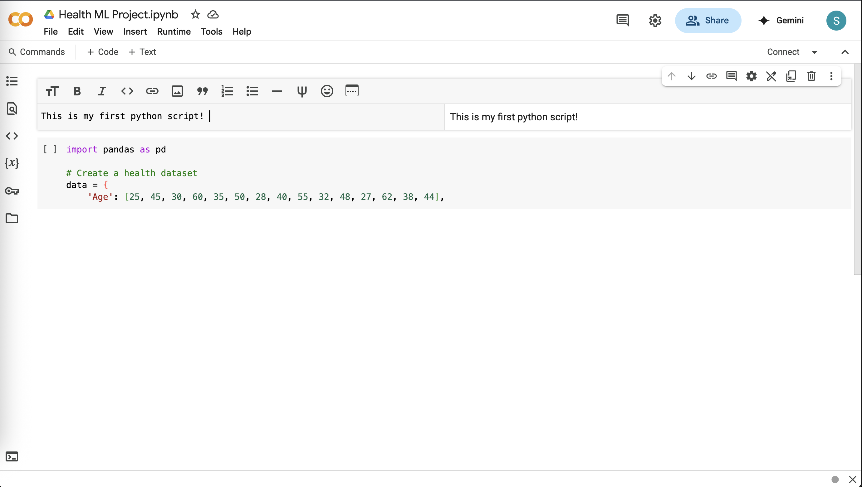
Here, the dataset contains health information about 15 people, such as their age and whether they smoke.
What are you doing? You’re using Python code to create and display the dataset as a table. This lets you see the health features and the risk of high blood pressure for each person.
import pandas as pd

# Create a health dataset
data = {
    'Age': [25, 45, 30, 60, 35, 50, 28, 40, 55, 32, 48, 27, 62, 38, 44],
    'Exercise_Hours': [3, 1, 0, 2, 4, 1, 5, 2, 0, 3, 1, 4, 0, 2, 3],
    'Diet_Quality': [3, 2, 1, 2, 3, 1, 3, 2, 1, 3, 2, 3, 1, 2, 3],
    # 1=Poor, 2=Average, 3=Good
    'Stress_Level': [2, 3, 3, 2, 1, 3, 1, 2, 3, 1, 2, 1, 3, 2, 1],
    # 1=Low, 2=Medium, 3=High
    'Smoking': [0, 1, 0, 1, 0, 0, 0, 1, 1, 0, 1, 0, 1, 0, 0],
    # 0=No, 1=Yes
    'High_BP_Risk': [0, 1, 1, 1, 0, 1, 0, 1, 1, 0, 1, 0, 1, 0, 0]
    # 0=No Risk, 1=Risk
}
df = pd.DataFrame(data)

# Show the first 5 rows
df.head()

# Show all rows
#df
df.head(). You can use # to comment out a line in Python. To uncomment, remove the #. All 15 rows will appear with df. Identify who has a high blood pressure risk and guess why based on their features (e.g., smoking or stress).What’s this about? Exploring data means looking for patterns, like whether people who exercise less have higher health risks. This helps you understand the data before building a model.
What are you doing? You’re using code to calculate statistics (like average age) and create a scatter plot to visualize if exercise hours relate to high blood pressure risk.
# Show summary statistics
df.describe()
import matplotlib.pyplot as plt

# Scatter plot
plt.scatter(df['Exercise_Hours'], df['High_BP_Risk'], color='blue')
plt.xlabel('Exercise Hours per Week')
plt.ylabel('High BP Risk (1=Yes, 0=No)')
plt.title('Exercise Hours vs. High BP Risk')
plt.show()
Age instead of Exercise_Hours. What do you see?What’s this about? Machine learning models need data split into inputs (features like age) and outputs (what you’re predicting, like high blood pressure risk). You also split the data into training (to teach the model) and testing (to check its performance).
What are you doing? You’re organizing the dataset so the model can learn from features and predict the risk, and dividing the data to ensure you can test the model fairly.
from sklearn.model_selection import train_test_split

# Features (inputs) and target (output)
X = df[['Age', 'Exercise_Hours', 'Diet_Quality', 'Stress_Level', 'Smoking']]
y = df['High_BP_Risk']

# Split into training and testing sets
X_train, X_test, y_train, y_test = train_test_split(X, y, test_size=0.2, random_state=42)

# Check sizes
print("Training set size:", X_train.shape)
print("Testing set size:", X_test.shape)
What’s this about? Training a model means teaching the computer to find patterns in the data, like how smoking might increase health risks. A Decision Tree model makes predictions by following a series of yes/no questions, like a flowchart.
What are you doing? You’re using a Decision Tree to learn from the training data and make predictions on the test data to see if it works.
from sklearn.tree import DecisionTreeClassifier

# Create and train the model
model = DecisionTreeClassifier(random_state=42)
model.fit(X_train, y_train)

# Predict on the test set
y_pred = model.predict(X_test)

# Show predictions
print("Predictions:", y_pred)
print("Actual:", y_test.values)
What’s this about? Accuracy measures how often the model’s predictions are correct. A higher percentage means the model is better at predicting high blood pressure risk.
What are you doing? You’re calculating the accuracy of your model by comparing its predictions to the actual test data results.
from sklearn.metrics import accuracy_score

# Calculate accuracy
accuracy = accuracy_score(y_test, y_pred)
print("Model accuracy:", accuracy * 100, "%")
What’s this about? Once the model is trained, you can use it to make predictions for new people by entering their health details. This shows how machine learning can be applied to real-world scenarios.
What are you doing? You’re entering values (like age or diet quality) to see if the model predicts a high blood pressure risk for a new person, testing its practical use.
# Get inputs for a new person
print("Enter health details:")
age = float(input("Age (years): "))
exercise_hours = float(input("Exercise Hours per Week: "))
diet_quality = input("Diet Quality (poor, average, good): ")
stress_level = input("Stress Level (low, medium, high): ")
smoking = input("Smoking (yes, no): ")

# Convert text to numbers
diet_map = {'poor': 1, 'average': 2, 'good': 3}
stress_map = {'low': 1, 'medium': 2, 'high': 3}
smoking_map = {'no': 0, 'yes': 1}
diet_num = diet_map[diet_quality.lower()]
stress_num = stress_map[stress_level.lower()]
smoking_num = smoking_map[smoking.lower()]

# Create new data
new_person = pd.DataFrame({
    'Age': [age],
    'Exercise_Hours': [exercise_hours],
    'Diet_Quality': [diet_num],
    'Stress_Level': [stress_num],
    'Smoking': [smoking_num]
})

# Predict
prediction = model.predict(new_person)
print("Prediction:", "At Risk of High BP" if prediction[0] == 1 else "Not At Risk")
Saving your work ensures you can return to it later or share it with others. Colab stores notebooks in Google Drive, making it easy to share.
File > Save in Colab to save your notebook.Share in the top-right corner and share the link with your instructor, or download it as a .ipynb file.Great job! You’ve built a machine learning model from scratch using Google Colab. You learned how to load and explore a health dataset, train a Decision Tree model to predict high blood pressure risk, and test it with your own inputs. You also visualized data patterns, checked model accuracy, and thought about what makes predictions work (or not). These skills—handling data, building models, and making predictions—are the foundation of data science!